
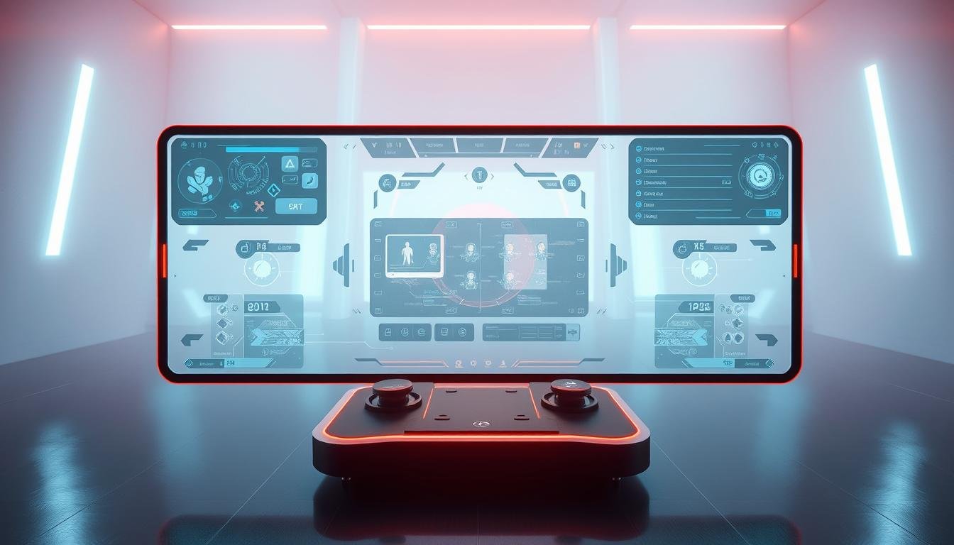
Welcome to the world of creating game interfaces that look and feel great everywhere. Players now enjoy titles on everything from large desktop monitors to smartphones. This shift makes adaptable layouts more important than ever.
This approach ensures that menus, heads-up displays (HUDs), and controls adjust automatically. They fit perfectly on any screen size. This is possible thanks to techniques like media queries and relative sizing units.
Building for games presents unique hurdles. Developers must balance real-time performance with complex interactive elements. A flexible layout is a key advantage for player retention and reaching a wider audience.
This guide will walk you through practical tips. You will learn how to craft interfaces that provide a smooth and consistent user experience across all platforms.
Key Takeaways
- Adaptable layouts are essential for modern games played on multiple devices.
- Techniques like media queries allow interfaces to resize automatically.
- Game development has unique challenges compared to standard web projects.
- A well-executed flexible interface improves player satisfaction and retention.
- This guide provides actionable strategies for creating versatile game UIs.
Understanding Responsive Design in Gaming
Think back to the early 2010s. A major shift happened. More people started browsing the web on phones and tablets than on desktops. This change forced a revolution in digital creation.
The principles that transformed web design now power modern game interfaces. Instead of building separate versions for each screen, developers create one flexible layout. This intelligent system adapts to different devices automatically.
For games, this approach is about more than just making buttons bigger. It involves a thoughtful restructuring of menus and controls. The goal is to maintain a clear visual hierarchy and smooth usability on any screen, from a 27-inch monitor to a 5-inch smartphone.
This method saves significant development time. It also ensures a consistent and high-quality user experience for every player. Embracing this flexible philosophy has become the industry standard for a good reason.
Responsive UI Design Fundamentals
The foundation of any versatile game interface is a combination of fluid grids, flexible images, and intelligent media queries. These three pillars work together to ensure your game’s visual components look sharp and function perfectly on any device.
A fluid grid system is the first piece of the puzzle. Instead of using fixed pixel sizes, this approach relies on relative units like percentages. This means every part of your interface, from inventory slots to menu buttons, occupies a proportional amount of space.
This method keeps the spatial relationships between elements consistent, no matter the screen dimensions. The visual arrangement scales beautifully, maintaining a clean and organized look.
Next, flexible images prevent graphics from breaking. Character portraits and item icons scale within their containers. They grow or shrink smoothly without becoming pixelated or distorted, preserving visual quality.
Finally, media queries act as the brain of the operation. They detect the player’s device and apply specific style rules at predefined breakpoints. This intelligent system automatically adjusts the entire layout for an optimal experience.
Mastering these fundamentals is a critical first step. They provide the core framework needed before tackling more advanced adaptive techniques for your game’s content.
Key Benefits of Responsive Design for Game Interfaces
Adopting a flexible layout strategy offers concrete advantages that go beyond simple aesthetics. It directly impacts your game’s reach and success. The most significant benefit is the ability to connect with a vastly larger audience.
More people access the web through mobile devices than ever before. By ensuring your game works flawlessly on them, you open the door to millions of potential players.
Data shows that over two-thirds of mobile users stay more engaged with interfaces that adapt to their screens. This leads directly to better player retention and longer sessions. A smooth experience keeps people coming back.
This approach also saves considerable development time and cost. Your team focuses on one master layout instead of building separate versions for each platform. This streamlined process is a major efficiency boost.
Your game’s discoverability improves as well. Search engines and app stores favor mobile-friendly experiences. This helps your title rank higher in search results, attracting more organic traffic.
Maintaining consistent visual branding across all devices strengthens player trust. It makes your game feel more polished and professional. Marketers report a 72% increase in conversions for websites with a responsive design, highlighting its real-world power.
These benefits make a flexible interface a critical component for any modern game project.
Embracing a Mobile-First Approach in Game UIs
Imagine designing your game’s interface with the smallest screen as your primary canvas rather than an afterthought. This mindset shift transforms how you approach layout creation from the very beginning.
Starting with mobile devices forces you to identify what truly matters in your game experience. You eliminate clutter and focus on core gameplay elements that players need most.
Prioritizing Essential Content for Small Screens
When space is limited, every element must earn its place. This approach helps you distinguish between critical information and nice-to-have features.
Health bars, action buttons, and primary menus take center stage. Secondary content can be progressively revealed as screen real estate increases.
Optimizing Tap Targets and Navigation
Touch screens require thoughtful interaction design. Create tap targets with minimum dimensions of 44×44 pixels for reliable finger contact.
Adequate spacing between interactive elements prevents accidental taps. This reduces player frustration and creates a smoother mobile gaming experience.
The mobile-first philosophy actually benefits desktop versions too. It results in cleaner, more focused interfaces that players appreciate on any device.
Fluid Grids and Flexible Layouts for Game Design
The secret to game interfaces that scale beautifully lies in implementing intelligent fluid grid systems. These grids form the backbone of adaptable game layouts that work across various screen sizes.
Instead of using fixed pixel measurements, fluid grids rely on percentage-based proportions. Every interface element occupies the same relative space regardless of the device’s screen dimensions.
Implementing a Fluid Grid System
CSS properties like grid-template-columns and grid-template-rows create flexible structures. These tools help organize inventory systems, skill trees, and menu layouts efficiently.
A fixed-width layout maintains identical dimensions on all devices. In contrast, fluid layouts intelligently fill available space. This approach optimizes screen real estate usage.
Consider a desktop game interface with a 4-column inventory grid. On a tablet, this can transform into a 2-column layout. Mobile devices might display a single-column arrangement.
The key advantage is maintaining visual hierarchy as the grid restructures itself. Elements retain their relationships even when screen sizes change dramatically.
Fluid grids eliminate awkward empty spaces and cramped interfaces. They ensure your game looks polished on any device, from smartphones to widescreen monitors.
Using Flexible Images and Media Queries in Games
The visual quality of a game’s interface relies heavily on how well its images adapt to different screens. Character portraits, item icons, and background art must scale perfectly within their containers. This automatic scaling is the core of flexible images.
For game elements like icons and buttons, Scalable Vector Graphics (SVGs) are the ideal choice. These XML-based files are lightweight and maintain perfect clarity at any resolution. They are a powerful tool for creating sharp visuals.
Media queries act as intelligent filters for your game’s layout. They detect the player’s device dimensions and apply specific styling rules. This ensures optimal image display for every screen size.
Implementing this is straightforward with CSS. Using properties like `max-width: 100%` and `height: auto` prevents distortion. Your images will maintain their correct aspect ratios as they scale.
Choose the right format for the job. Use SVGs for vector-based interface elements. For photographic textures, modern formats like WebP offer excellent compression. You can even use media queries to serve high-resolution versions only on larger screens.
Combining flexible images with intelligent media queries creates interfaces that look professional on any device. Your game will appear crisp on a budget smartphone or a 4K monitor.
Designing Across Different Screen Sizes and Devices
When players access your game on different devices, your interface must transform intelligently to maintain usability and visual appeal. This requires strategic planning for how elements rearrange themselves across the full spectrum of screens.
Common starting points help organize this process. Think about mobile screens around 360-480 pixels, tablets at 768 pixels, and desktop monitors from 1024 pixels upward. These breakpoints serve as helpful guides for when your layout needs adjustment.
Strategies for Adjusting Game Elements
At each breakpoint, game components should adapt naturally. A multi-column inventory might collapse into a single scrollable list on mobile. Horizontal action bars often stack vertically on smaller screens.
Consider a quick-action bar with ten buttons. On desktop, all buttons appear. Tablets might show six primary actions with a “more” menu. Mobile versions could display just three essential buttons with an overlay for others.
Setting Effective Breakpoints
The most effective breakpoints occur where your interface naturally breaks down. Test your game on various devices to identify these critical points. Don’t rely solely on standard device categories.
Remember that orientation matters too. Portrait and landscape modes on mobile and tablet devices create five distinct layouts to consider. This comprehensive approach ensures your game feels native on every device.
Utilizing CSS Techniques and Media Queries for Adaptive Game Interfaces
Let’s get technical and explore the CSS code that brings adaptive game interfaces to life. The magic happens with the `@media` rule. This powerful command lets you apply different style rules based on the player’s device.
You define conditions inside the rule. Common conditions check the viewport’s width, height, and resolution. For example, `min-width: 768px` targets tablets and larger screens.
A mobile-first approach is a best practice. You write your base CSS for small screens. Then, you use media queries to add enhancements for larger viewports.
This method ensures your game looks great on phones first. It then scales up beautifully for desktops. You can also detect screen orientation.
Use a condition like `orientation: landscape` to rearrange your layout when a player rotates their tablet. Combining these queries creates sophisticated, adaptable behavior for any screen.
Best Practices for Reducing Clutter in Interactive UIs
Think of a game interface that feels clean and uncluttered, even during intense action sequences. This approach helps players focus on gameplay rather than struggling with complex menus. Minimalism creates interfaces that users can understand instantly.
Reducing visual clutter makes content easier to read and digest. This is especially important on smaller screens where space is limited. Players appreciate interfaces that prioritize what they need most.
Minimalism isn’t about removing features. It’s about organizing content intelligently. Use progressive disclosure to reveal complexity only when users need it.
Techniques like navigation drawers and collapsible panels keep non-essential elements hidden. This gives players control over their experience. They can access secondary information without overwhelming the main view.
Clean interfaces load faster because they require less code. This creates a snappier experience for your website visitors. Faster loading times also help with technical performance.
Establish clear visual hierarchy for critical gameplay information. Health bars and objective markers should remain prominent. Secondary details stay accessible but unobtrusive.
This approach reduces cognitive load, allowing players to focus on gameplay. A thoughtful design creates a better overall experience for all users.
Advanced Techniques: Container Queries and Fluid Typography
Ready to take your game’s adaptable interface to the next level? New CSS features offer incredible precision. Container queries and fluid typography give you fine-tuned control over how elements look and feel.
Container queries are a game-changer. Instead of reacting to the entire screen size, a component can adapt to the space of its parent container. Use the `@container` rule to change a card’s layout or text size based on its own width.
Imagine a character stat card. In a narrow sidebar, it might show just an icon and a number. In a wide inventory panel, it could display a full description. This modular approach creates incredibly flexible layouts.
For your game’s text, the `clamp()` function is essential. It makes typography scale smoothly. Your headlines will stay readable on any device without manual adjustments at every breakpoint.
Try this code: `font-size: clamp(1rem, 2vw + .5rem, 1.5rem). It sets a minimum, preferred, and maximum font size. The text grows with the viewport but never gets too small or too large.
Combining these techniques is a powerful strategy. You create intelligent components that manage their own appearance. This leads to cleaner code and a more consistent player experience across all screen sizes.
Enhancing Performance and SEO with Responsive Design in Games
Search engines now prioritize websites that deliver exceptional experiences on smartphones and tablets. This shift makes adaptable layouts essential for game discoverability. Google’s mobile-first indexing means your game’s web presence must shine on mobile devices first.
Consider this: 94% of smartphone users search for content on their phones. A flexible approach ensures your game appears in these searches. Search engines reward mobile-friendly websites with better positions.
Core Web Vitals are key metrics for evaluation. LCP measures how quickly main content loads. CLS tracks visual stability during loading. INP assesses interactivity responsiveness.
Optimization techniques make a real difference. Properly size images with width and height attributes to prevent layout shifts. Minimize CSS and JavaScript files. Load assets conditionally based on the viewport.
This strategy delivers only necessary resources for each device. It reduces data transfer and improves load times. Faster loading creates better user experiences that keep players engaged.
Investing in adaptable layouts pays dividends through improved search rankings. You’ll see increased organic traffic and higher conversion rates. It’s a smart strategy for any game’s online success.
Integrating Responsive Design Into Your Game Development Workflow
Bringing adaptable layouts into your development process requires the right tools and systems. Modern prototyping platforms make this integration smooth and efficient.
Establishing a consistent workflow from concept to code ensures your game looks great on every device. This approach saves time and reduces errors during implementation.
Leveraging Design Systems and Prototyping Tools
Tools like Figma allow creators to build multiple frames for phones, tablets, and desktops. The auto-layout feature defines how elements resize across different screens.
Creating reusable component libraries maintains consistency across all versions. These stored elements behave predictably on various devices.
Frameworks like Bootstrap offer pre-built navigation bars and grid systems. These ready-made parts accelerate development while ensuring mobile-friendly behavior.
Handoff tools streamline collaboration between teams. Developers can extract exact specifications and code snippets directly from prototypes.
Platforms like UXPin Merge sync code components with design editors. This ensures designers work with production-ready elements.
Integrating adaptable thinking early creates better interfaces with fewer revisions. This strategic approach benefits your entire project timeline.
Real-World Inspirations from the Gaming Industry
Looking beyond the gaming world reveals powerful lessons in adaptable digital interfaces from companies that have mastered cross-platform excellence. These real-world examples offer valuable insights for creating game interfaces that work beautifully on any screen.
Airbnb’s website demonstrates how images can seamlessly adapt to different screen sizes. Users enjoy a consistent booking experience whether they use a computer, tablet, or mobile app.
Patagonia’s e-commerce site shows smart navigation strategies. Their top menu hides page links behind a hamburger icon on smaller screens, preserving space while keeping all content accessible.
The Washington Post organizes vast amounts of information with horizontal scrolling menus and collapsible categories. This approach works beautifully from mobile to desktop viewing.
Apple maintains its clean aesthetic across devices through flexible layouts and adaptive navigation. Dropbox uses fluid grids that automatically adjust content to fill available screen space efficiently.
These examples provide concrete models that game developers can adapt. Studying these successful implementations offers practical inspiration for creating interfaces that deliver exceptional experiences on every device.
Final Thoughts on Elevating Game Interfaces with Responsive Design
Mastering the art of flexible game layouts represents a significant competitive advantage in today’s multi-device gaming landscape. While the principles seem straightforward, effective implementation demands careful planning and attention to detail.
This approach naturally encourages the uniformity and simplicity that create outstanding user experience. Players enjoy consistent interactions whether they’re on a large monitor or a compact mobile screen.
Testing across different devices and browsers remains crucial. This ensures your interface truly adapts appropriately rather than just meeting technical criteria.
The benefits extend beyond player satisfaction. Search engines favor mobile-friendly experiences, improving your game’s discoverability. Mature frameworks make implementation cost-effective.
View this as an ongoing practice that evolves with new technologies. Embracing responsive web design elevates your game interfaces from functional to exceptional, delighting players regardless of their chosen platform.