The first thing players see when they open your game is the main interface. This initial view sets the tone for the entire experience. A well-crafted layout is crucial for making a strong first impression and guiding users smoothly into the action.
Leading game developers understand that this area must balance beauty with clear function. The goal is to create an interface that is both visually appealing and easy to navigate. Players should find what they need without confusion or delay.
This guide explores outstanding examples from popular titles. We will break down the choices that make these interfaces successful. You will see how different styles, from simple and clean to rich and detailed, can effectively serve various game genres.
By studying these principles, you can build an interface that players love to use. A great design not only looks stunning but also keeps users engaged and coming back for more.
Key Takeaways
- The main interface is the critical first touchpoint for players.
- Successful designs perfectly merge aesthetic appeal with functional clarity.
- Different visual styles can be effective for different types of games.
- Intuitive navigation is essential for a positive player experience.
- Analyzing top-tier examples provides actionable insights for your own projects.
- A well-designed interface directly supports player retention and satisfaction.
Cutting-Edge Menu Screen Inspiration
Today’s most successful mobile games feature interfaces that feel like natural extensions of the gameplay itself. The navigation systems in these top titles have evolved far beyond simple lists.
They now incorporate clever ideas from modern web design, like sticky headers and smooth slide-out panels. These features create a seamless experience for the user.
Visual elements are carefully crafted to guide players intuitively. Every icon and button reinforces the game’s unique brand and theme. This creates a cohesive and memorable world from the very first glance.
Animation plays a key role in modern interfaces. Subtle transitions and micro-interactions turn a static screen into a dynamic space. This delights players and makes every interaction feel responsive and polished.
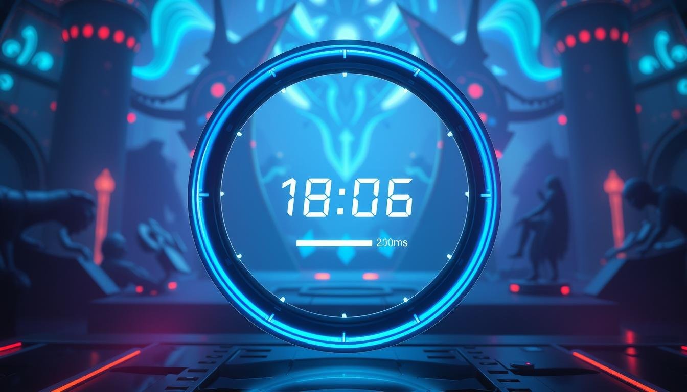
Developers use a variety of layouts to suit their game’s needs. You’ll find sleek sidebar menu systems, immersive full-screen overlays, and even innovative circular selectors. These examples show how design choices directly support the game’s content structure.
By studying these leading examples, you learn to balance fresh ideas with familiar patterns. The goal is an interface that feels both innovative and instantly understandable to every user.
Exploring Hidden Navigation Menus in Mobile Design
Smartphone game interfaces often face a common challenge: how to provide full functionality without cluttering the limited display area. Hidden navigation systems offer an elegant solution that has become essential in modern mobile game development.
Visible vs. Hidden Menu Options
The decision between visible and hidden navigation depends on your game’s complexity. Simple games with few controls work well with always-visible options. More complex titles benefit from hidden approaches that prevent visual overload.
These hidden systems typically use familiar triggers like hamburger icons or three dots. Players instinctively know to tap these symbols to reveal additional controls. The placement in upper corners makes them easy to find without dominating the screen.
Enhancing User Engagement through Minimalism
Hidden navigation creates cleaner interfaces that boost player focus. By removing constant visual elements, players immerse themselves more deeply in gameplay. This minimalist approach reduces cognitive load and decision fatigue.
The psychological benefit comes from presenting options only when needed. This creates a more intuitive experience where players control when they see navigation controls. The result is a interface that feels both powerful and unobtrusive.
This design philosophy prioritizes the game content while maintaining full functionality. It represents a smart balance between discoverability and screen efficiency that today’s users appreciate.
Understanding the Role of Menu Design in Game UIs
The architecture of a game’s navigation directly shapes how players perceive and interact with the entire experience. It acts as the central hub, connecting users to every feature and setting.
A thoughtful design is the backbone of a positive user experience. It ensures players can move through the game without confusion or frustration.
Impact on User Experience
When navigation is intuitive, it feels almost invisible. Players focus on the game itself, not on how to find things.
A poor layout, however, creates friction. This can lead to players leaving the game. A smooth experience keeps users engaged and happy.
Strategic Layouts for Mobile Devices
Designing for mobile devices requires special attention. Touch targets must be large enough for fingers. Important options should sit within easy thumb reach.
The goal is a clean layout that works on various screen sizes. This strategic approach makes the game accessible and enjoyable for all users.
Iconic Examples from Top Mobile Games
Leading mobile titles showcase navigation systems that have become industry benchmarks for excellence. These interfaces demonstrate how clever design choices can enhance player engagement while maintaining smooth functionality.
Sticky Slide Out and Animated Menus
Sticky slide-out systems have emerged as a favorite among developers. They remain accessible during gameplay while occupying minimal space when collapsed.
Animated interfaces transform basic navigation into engaging experiences. Smooth transitions and micro-interactions create a dynamic feel that players appreciate. These elements reinforce the game’s personality through thoughtful motion design.
The combination of sticky accessibility and fluid animation represents a powerful approach. It balances visual appeal with practical functionality that users find intuitive.
Real-World Inspiration from Leading Titles
Top games often feature morphing fullscreen navigation that achieves 60fps performance. This ensures lag-free transitions that don’t compromise gameplay responsiveness.
Some developers borrow principles from fintech applications, bringing fresh perspectives to game interfaces. These adaptations demonstrate how cross-industry ideas can enhance user experience.
By studying these successful implementations, you gain practical insights for your projects. The key is adapting core principles to match your game’s unique aesthetic and audience expectations.
Spotlight on Mega Menu Designs
Modern gaming applications with rich content libraries require sophisticated navigation solutions that go beyond basic dropdowns. The mega menu approach brings web design innovation to mobile games, creating expansive panels that display multiple columns of options.
This advanced system helps players navigate complex game architectures with ease. It organizes numerous features into intuitive groupings that reduce clicks to key content.
Multi-Column Structures and Visual Aids
Multi-column layouts within mega navigation systems allow simultaneous display of many items and categories. Traditional single-column approaches often create overwhelming density.
Visual elements like icons and color-coding enhance usability significantly. They provide quick cues that help users identify desired sections faster than text-only interfaces.
Responsive Behavior for Mobile Compatibility
Responsive adaptation is crucial for mega navigation on mobile devices. These systems must transform from multi-column formats to touch-friendly versions.
Successful implementations often use accordion-style or stacked layouts on smaller screens. This preserves organizational benefits while optimizing for touch interactions.
The design balances information density with visual breathing room. It provides enough options to reduce navigation clicks without overwhelming users with excessive choice.
This approach works exceptionally well for games with extensive character rosters or complex progression systems. It makes intricate content structures feel manageable and accessible to all players.
Diverse Menu Layouts for Different Game Genres
Successful game interfaces adapt their organizational structure to match the specific demands of each gaming genre. The navigation system must serve the game’s core mechanics while meeting player expectations.
Simple puzzle games thrive with clean, focused layouts. Complex RPGs need detailed systems to manage extensive features. Each genre has established conventions that guide effective interface design.
Minimalist vs. Detailed Approaches
Minimalist navigation strips away non-essential elements. This approach uses generous whitespace and limited categories. Players appreciate the clarity and direct access to gameplay.
These simple layouts often feature bold typography and distinctive color schemes. They prove that limited content doesn’t mean sacrificing personality. The focus remains squarely on the gaming experience.
Detailed designs organize extensive options through multiple categories and hierarchical structures. They accommodate games with rich feature sets and complex systems. This approach ensures all functionality remains accessible.
These comprehensive systems use tabs, nested lists, and scrollable sections. They prevent overwhelming users while providing complete access. The organization supports power users who need deep control.
Understanding genre conventions helps make strategic layout decisions. Casual games benefit from streamlined navigation. Hardcore titles require robust systems that support complex interactions.
Integrating Visual Elements: Fonts, Icons, and Images
The visual components of your game’s interface work together to create a cohesive player journey. These elements transform functional layouts into immersive brand experiences that connect emotionally with users.
Font selection establishes immediate personality. Bold, chunky typefaces convey energy for action games. Elegant serif or script fonts create sophistication for narrative titles.
Icons serve as universal visual language. They help players recognize functions instantly without reading text labels. This approach benefits international audiences and visual learners.
Strategic image use adds richness and context. Background images establish atmosphere while category visuals illustrate content. Each element should guide users clearly.
Balance prevents visual clutter. Ensure every component serves a purpose in communication or navigation. Background elements should support rather than compete with foreground content.
Typography choices extend beyond font selection. Consider sizing, weight variations, and color treatments. These create clear hierarchies that help primary options stand out.
Consistent style across all interface areas builds trust. Repeating fonts, icon styles, and color palettes create unified brand experiences throughout your game.
Navigation Bar and User Interaction Trends
Modern navigation systems in games now incorporate sophisticated interaction patterns that respond to user behavior. The navigation bar has evolved from simple static elements to dynamic components that enhance player engagement.
These systems adapt to different gameplay contexts while maintaining consistent accessibility. Players expect intuitive controls that feel responsive and polished throughout their gaming sessions.
Creative Transitions and Hover Effects
Creative transitions transform basic navigation into engaging experiences. Smooth animations and state changes create moments of delight for users. These effects make routine interactions feel intentional and polished.
Touch-responsive elements provide immediate feedback through visual changes. This confirms interactions and guides players toward successful task completion. The design creates a responsive feel that distinguishes professional games.
Sticky behavior keeps the navigation bar accessible during scrolling. This balances visibility with screen space needs. Micro-interactions add layers of polish through subtle animations and color transitions.
These trends create experiences that feel alive and responsive. Thoughtful implementation reinforces the overall quality perception users form about your game. The right effects make navigation feel seamless and enjoyable.
Designing for Scalability and Usability
A truly great game interface is built not just for today, but for the future growth of your project. Scalable design ensures your navigation system can expand smoothly. It accommodates new features and content without confusing your users.
Think about your layout from the start. Create flexible category structures that can grow. This forward-thinking approach prevents major redesigns later. It keeps the user experience consistent and familiar.
Usability is always the top priority. Every choice must help users achieve their goals quickly. This is especially important on mobile devices. Touch targets must stay easy to tap, even as you add options.
Use smart techniques for complex systems. Scrollable sections and tabbed interfaces work well. They reveal information only when needed. This prevents overwhelming players with too many choices at once.
Always design with accessibility in mind. Clear labels and good color contrast help everyone. A scalable system serves your players well at launch and for years to come.
Case Studies: Menu Design Inspiration from Industry Leaders
Looking beyond gaming reveals powerful navigation strategies from successful companies. These real-world examples offer fresh perspectives on organizing complex content.
Top brands like eBay and Webflow demonstrate how to handle extensive feature sets. Their approaches provide concrete patterns you can adapt for your projects.
Analyzing Successful Mobile Menu Screens
eBay’s category-first system shows how to organize vast catalogs. Expandable submenus and personalized suggestions create efficient navigation. This approach works well for games with extensive item collections.
Webflow’s clean interface proves complexity can remain approachable. Intuitive icons and clear descriptions serve both new and experienced users effectively.
The text-only approach used by Adidas and IBM highlights visual simplicity’s benefits. Fast load times and easy scanning become priorities when designing for mobile users.
ASOS’s dynamic layout with visual cues translates perfectly to game promotions. Highlighting limited-time events or new content drops grabs player attention effectively.
These examples reveal common success patterns across industries. Clear grouping, logical structure, and responsive behavior create navigation that users love.
Balancing Aesthetic Appeal with Functionality
Finding the perfect equilibrium between visual charm and practical utility stands as a core objective in interface development. This delicate balance determines whether players feel engaged or frustrated when navigating your game.
Visual appeal draws users into your game world immediately. Beautiful elements create positive first impressions that communicate quality. However, purely decorative choices that slow down navigation can harm the overall user experience.
The most successful design approaches achieve harmony. Color coding and thoughtful iconography make interfaces more attractive while improving usability. Every visual component should serve both aesthetic and functional purposes.
Functionality must never be sacrificed for beauty. Yet this doesn’t mean accepting boring interfaces. Creative designers find ways to make practical elements visually appealing through elegant typography and cohesive visual systems.
Players form quick judgments about your entire game based on interface aesthetics. Investing in polished, professional-looking navigation pays dividends in player retention. Testing with real users reveals whether your design choices enhance or hinder their experience.
The ideal balance varies by audience. Casual games might prioritize friendly aesthetics, while competitive titles often favor streamlined efficiency. An iterative design process helps achieve this crucial equilibrium.
Incorporating Responsive Design for Mobile Devices
Your game’s interface must feel right at home on any device a player chooses. A responsive design automatically adjusts your layout to fit different mobile devices. This creates a consistent and enjoyable experience for all users.
Think about how your navigation transforms from a wide tablet view to a narrow phone screen. Multi-column structures often shift to simple, stacked lists. This keeps all options easy to see and tap.
Touch-Friendly Navigation Techniques
Fingers need more space than a mouse cursor. Touch-friendly techniques make every interaction smooth. Buttons should be at least 44 pixels square to prevent mis-taps.
Place key elements within the natural thumb zone. This area is easy to reach when holding a phone with one hand. Smart placement reduces hand strain and keeps players engaged.
Consider adding gestures like swiping between pages. These movements feel natural on mobile devices. They give users more ways to explore your game’s interface quickly.
Always test your design on real phones. Simulators can miss performance issues or tricky touch targets. Real-world testing ensures your navigation works perfectly for everyone.
Leveraging Animation and Microinteractions in Menus
Movement brings life to your game’s interface, transforming basic navigation into an engaging experience. Thoughtful animation turns static layouts into responsive environments that feel alive and polished.
Subtle Effects That Enhance the Experience
Small details make a big difference in how players perceive your game. Gentle button presses and smooth panel slides create satisfying interactions.
These microinteractions provide immediate feedback when users tap elements. Color shifts and scaling effects acknowledge input without overwhelming attention.
Motion serves functional purposes beyond aesthetics. It guides player focus and communicates relationships between different areas.
Maintaining a Smooth, Fun UI Flow
Performance is crucial for animated navigation. Effects must run at consistent 60fps to prevent lag that frustrates users.
Optimization techniques like CSS transforms ensure smooth performance across devices. Restraint is key—every animation should feel purposeful.
Players interpret polished microinteractions as signs of quality craftsmanship. This positive perception influences their entire experience with your game.
Enhancing Navigation with Customizable Templates
Customizable templates offer a powerful shortcut for creating effective navigation systems without sacrificing originality. Instead of building every component from scratch, you can start with proven foundations.
Resources like NavNav provide over 90 responsive navigation examples with tutorials. These showcase diverse implementation approaches using standard web technologies. HappyAddons offers versatile mega menu templates designed for Elementor users.
These template libraries demonstrate impressive design flexibility combined with solid performance. They offer smooth ways to organize complex content while maintaining clean multi-column layouts.
The advantage of template-based design is learning from accumulated industry knowledge. Each template encapsulates decisions about spacing and hierarchy refined through real-world usage.
Using templates doesn’t mean sacrificing your unique style. Treat them as foundations for creativity. Customize every visual aspect until the final navigation reflects your game’s distinct personality.
Template options span various navigation styles including sidebar systems and fullscreen overlays. This gives you starting points regardless of which approach best suits your game’s needs.
Customizable templates also serve as educational resources. Study implementation examples to understand why certain design choices work well. Build your expertise while creating navigation that benefits from established conventions.
Implementing Mega Menu Best Practices
When implementing mega menus, thoughtful grouping and labeling become critical success factors. These expansive navigation systems handle complex content beautifully when designed with clear organization.
Grouping Related Items and Clear Labeling
Effective mega menu design starts with logical grouping of related items. Create clear categories that match how users think about your game’s features.
Use specific, descriptive labels instead of vague terms. Instead of “Settings,” try “Audio & Visual Preferences.” This helps users find what they need quickly.
Limit your mega menu to 2-5 columns for optimal scanability. Too many columns create visual clutter that overwhelms users. Keep the most important items visible without scrolling.
Visual aids like icons can enhance usability when they add real value. Avoid decorative elements that clutter the interface. Every component should help users navigate more efficiently.
Plan for future growth by designing scalable category systems. Your mega menu should accommodate new features without confusing existing users. This forward-thinking approach maintains consistency as your game evolves.
Final Reflections on Innovative Menu Designs
Reflecting on the diverse design strategies covered, it becomes clear that the most effective game interfaces feel almost invisible to players. The best navigation systems work so seamlessly that users focus entirely on gameplay rather than the interface itself.
Successful approaches share common traits regardless of their specific implementation. They prioritize clarity, consistency, and responsiveness above all else. The design examples throughout this article show that innovation means thoughtfully evolving familiar patterns.
Ultimately, the measure of navigation success isn’t aesthetic praise but whether users achieve their goals effortlessly. A great user experience keeps players engaged and coming back. Your interface should serve as a smooth gateway to enjoyment.
Remember that visual elements must enhance rather than hinder the player’s experience. When your design aligns with how people naturally think, interaction becomes intuitive and rewarding.