
Creating dynamic visual indicators is a key part of modern game development. These elements show important information to players in a clear and engaging way. This tutorial introduces a powerful method for displaying stats like character skills or health.
Circular indicators are an intuitive and space-efficient choice for user interfaces. They work well where traditional horizontal designs may not fit the aesthetic of your project. You can use them for loading status, matchmaking ratings, and other gameplay metrics.
We will explore two main approaches to build this feature. You will learn about shader-based implementations using advanced tools. We will also cover UI-based methods with the built-in canvas system.
This guide uses real-world examples and proven techniques from the development community. You will gain practical knowledge for your current and future game projects. Mastering this visualization will enhance your UI design capabilities.
Key Takeaways
- Circular indicators provide an intuitive way to display quantitative information in games.
- This guide covers both shader-based and UI-based implementation methods.
- The techniques are applicable to various project types, from mobile to VR experiences.
- You will learn to showcase dynamic metrics like character skills and loading status.
- The tutorial is structured for a logical learning progression from basic to advanced concepts.
- Gain practical knowledge that can be immediately applied to your development work.
- Improve player experience through clear and elegant information display.
Understanding the Basics of Radial Progress Bars in Unity
The evolution of game interfaces has seen a shift toward circular visualization tools that offer both aesthetic and functional benefits. These elements provide an intuitive method for displaying various metrics to players. They work exceptionally well in situations where traditional linear designs may not fit the visual theme.
What Is a Radial Progress Bar?
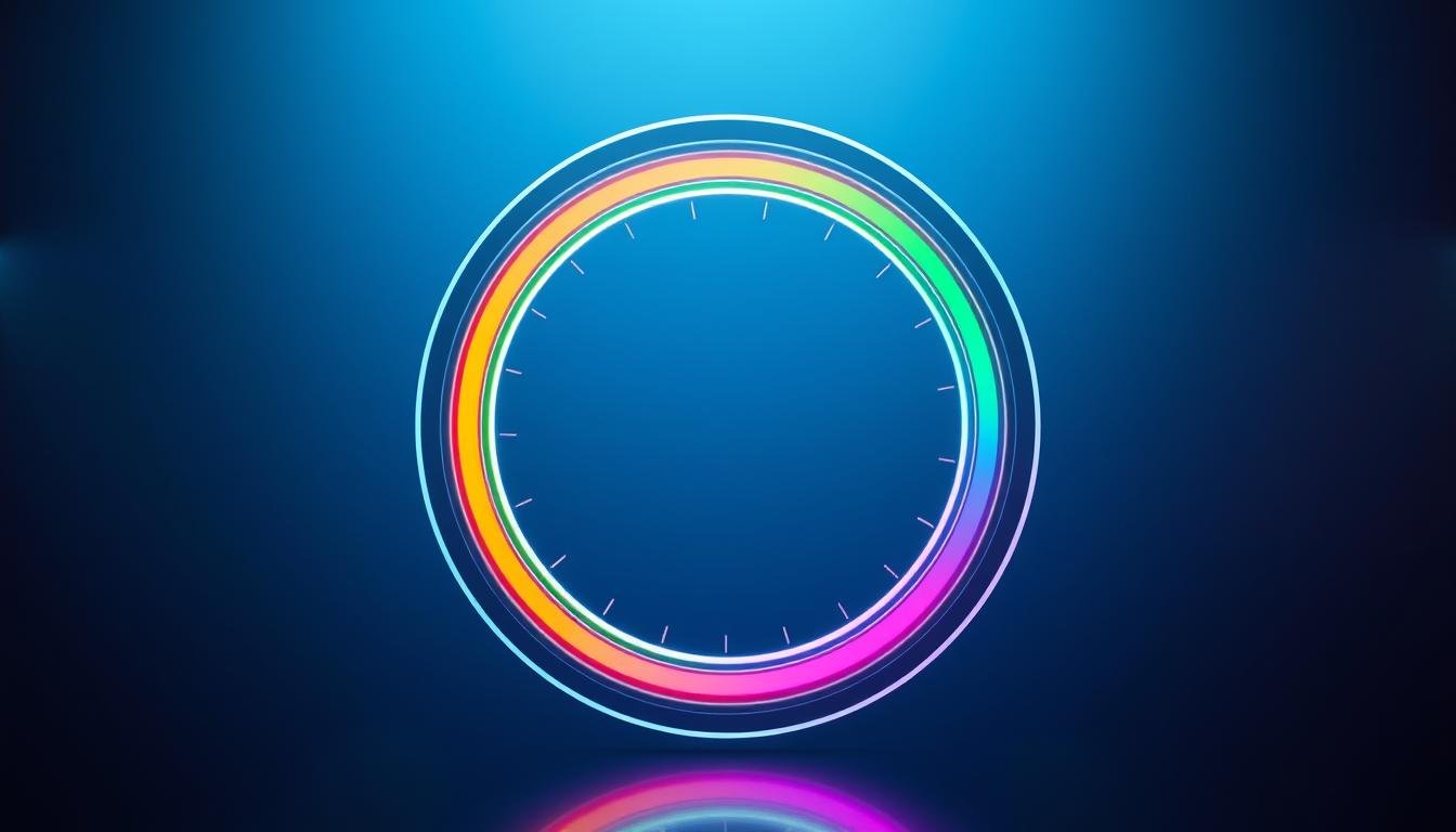
A circular indicator fills progressively around a central point to represent completion or resource levels. This design offers a clear visual representation of quantitative data. It serves as an effective alternative to standard linear interfaces.
The fundamental concept involves controlling the fill amount of a circular shape. This is typically measured in degrees from 0 to 360. Understanding this mathematical relationship is essential for proper implementation.
Key Concepts Behind Circular and Radial Design
Circular patterns are naturally appealing to human perception. They can convey information quickly when multiple indicators are grouped together. This makes them ideal for showing different character attributes simultaneously.
These visual elements can be designed with various starting positions and fill directions. The choice between implementation methods depends on specific project requirements. Shader-based approaches offer more customization while UI methods provide simpler integration.
Setting Up Your Unity Project for the Tutorial
Initial setup procedures determine the efficiency of your development workflow throughout the entire process. A well-organized workspace prevents common issues when implementing visual components. Proper configuration from the beginning saves significant time during later stages.
Starting with a clean slate ensures you can focus on the core implementation without distractions. This approach applies whether you’re working on mobile games or complex VR experiences.
Importing Assets and Configuring Sprites
Begin by obtaining a circular image with a transparent background. Import this asset into your development environment using the standard import workflow.
Change the Texture Type to “Sprite (2D and UI)” in the Inspector panel. This critical step ensures proper rendering within the interface system. Correct sprite configuration enables smooth integration with canvas elements.
Creating the Canvas and UI Elements
Navigate to GameObject → UI → Canvas to create your main interface container. Choose the appropriate render mode based on your specific requirements.
Organize your hierarchy with clear naming conventions for different components. Proper structure makes it easier to manage complex visual systems as your project grows.
Creating and Customizing Your Unity Radial Progress Bar
The assembly phase transforms basic UI elements into a functional circular display system through strategic layering and parameter adjustment. This process establishes the foundation for dynamic visual feedback in your interface.
Building the Basic Progress Bar Structure
Begin by adding an Image component to your Canvas hierarchy. Assign your prepared circular sprite to the Source Image field. Set an initial color like red for clear visibility.
The critical configuration involves changing the Image Type from “Simple” to “Filled.” Select “Radial 360” as the Fill Method. This transformation enables dynamic control through the Fill Amount parameter.
Adjusting the Fill Amount and Visual Settings
The Fill Amount property accepts values from 0 to 1, representing 0% to 100% completion. This single value controls the visible portion of your circular indicator. It serves as the primary control parameter for real-time updates.
Create a layered design by duplicating your image. Change the duplicate’s color to white and set its Image Type to “Simple.” Position this inside your main filled image to establish visual hierarchy.
Adjust dimensions for better visual balance. Increase the outer image size while maintaining proper proportions. Experiment with different color schemes and opacity levels to match your game’s aesthetic.
Integrating Advanced Features and Shader Customization
Advanced customization capabilities become accessible through specialized tools that transform basic visual elements into dynamic, professional-grade components. These techniques elevate your interface design beyond standard implementations.
Utilizing the Amplify Shader Editor for Enhanced Effects
The Amplify Shader Editor provides a visual interface for creating sophisticated effects without complex coding. This powerful tool offers two variants: standard and simplified versions.
The standard option gives comprehensive control over every visual aspect. The simplified one removes many settings for basic functionality. Both approaches deliver impressive results.
Optimizing Background, Border, and Texture Settings
Background customization allows precise control over filled and unfilled areas. You can define border properties including width and opacity settings.
The texture system supports three layers with independent parameters. Each layer offers controls for opacity, contrast, and positioning. Understanding how these layers interact creates complex visual effects.
Optimizing these settings ensures good performance across different platforms. Proper configuration maintains visual quality while delivering smooth performance.
Implementing the unity radial progress bar in Your Project
Script integration transforms your visual component into a responsive element that reacts to game data. This connection between design and functionality creates engaging player experiences.
Linking UI Elements and Scripting the Behavior
Create a new C# script called “SC_CircularLoading” to manage your circular indicator. This script should include public references to your Image and Text components.
The core logic involves updating the fillAmount property with values from 0 to 1. Use Unity’s Range attribute to create an inspector slider for testing. This provides an excellent way to visualize changes during development.
Your Update method should synchronize the visual display with your progress variable. The text component can show percentage values or status messages. Proper linking ensures your code controls the intended visual elements without runtime errors.
Demonstrating Real-World Use Cases and Examples
Circular indicators serve many purposes in game development. They work well for character health displays and ability cooldown timers.
Loading screens during scene transitions benefit from this visual approach. Resource management systems also use circular designs effectively.
Study provided examples to understand different implementation approaches. While these scripts may need optimization for production, they offer valuable learning opportunities. You can extend them with animation curves and color transitions.
Conclusion
Developing professional UI components requires both technical skill and design sensibility, as demonstrated in this tutorial. You now possess multiple approaches for creating effective circular indicators.
The techniques covered provide flexible solutions for various project needs. Whether you’re building loading screens for transition sessions or complex ability trackers, these methods deliver results.
Remember that effective design prioritizes clarity above all else. The way you implement these elements should enhance player understanding without causing confusion.
Use the provided examples as starting points for your own innovations. Experiment with different color schemes and background treatments to match your game’s aesthetic.
This knowledge represents one valuable addition to your development toolkit. Continue exploring new approaches as the Unity community shares fresh content and techniques.
FAQ
What is the primary purpose of a circular loading indicator in a user interface?
Which built-in component is essential for controlling the fill percentage of the circle?
Can I customize the appearance of this element beyond a simple color change?
How do I make the bar’s value change dynamically during a game session?
Are there common pitfalls to avoid when implementing this UI feature?

Game developer with over 10 years of professional experience specializing in the mobile sector. George’s journey began with a passion for indie development, leading him to contribute to several successful mobile titles, including the critically acclaimed puzzle-platformer ChronoShift and the top-down strategy game Pocket Empires.