
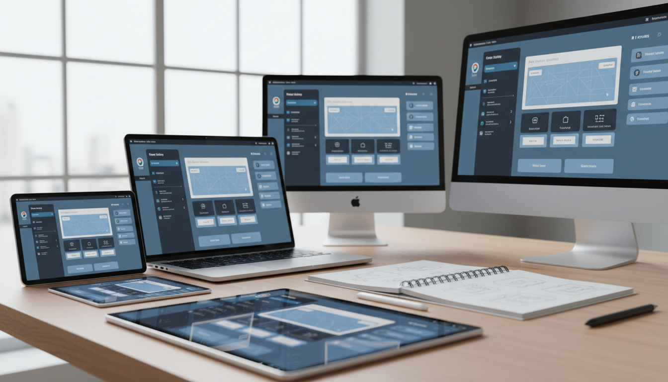
Today’s digital landscape presents a significant challenge for designers. Creating visual elements that work well across various devices has become essential. People use smartphones, tablets, desktop monitors, and high-DPI displays daily.
The range of display specifications continues to expand dramatically. From standard laptops to 4K monitors and Retina displays, each device demands careful attention. Resolution independence is now a fundamental requirement, not an optional feature.
Poorly adapted visual components lead to frustrating user experiences. Blurry images, misaligned elements, and inconsistent spacing can damage brand perception. These issues often result in decreased user engagement and satisfaction.
This comprehensive guide explores practical solutions for this modern design challenge. We cover essential principles, adaptation techniques, and optimization strategies. You’ll learn industry-proven methods to maintain crispness and clarity across all platforms.
Design professionals must balance aesthetic appeal with technical constraints. The goal is creating components that perform efficiently without sacrificing visual quality. This approach ensures interfaces remain functional and appealing regardless of pixel density.
Key Takeaways
- Resolution independence is essential in today’s multi-device world
- Poor scaling leads to blurry images and misaligned interface elements
- Modern displays range from standard laptops to high-DPI screens
- Visual consistency impacts both user experience and brand perception
- Balancing design aesthetics with technical requirements is crucial
- Practical methods exist for maintaining quality across different resolutions
- Professional approaches ensure crisp, clear visuals on any device
Understanding Resolution Independence in UI Design
Creating visual elements that adapt seamlessly across various platforms is now essential for professional design. This approach ensures interfaces maintain quality regardless of the device they appear on.
What is Resolution Independence?
Resolution independence means designing interface components once for correct rendering across all display specifications. This eliminates the need for separate versions for different target devices.
Understanding pixel density is crucial here. DPI (Dots Per Inch) and PPI (Pixels Per Inch) measure how densely pixels are packed on a display. Higher density settings create sharper, clearer visuals for the user.
Standard resolutions like 1920×1080 or 3840×2160 define pixel dimensions and aspect ratio. However, pixel density determines actual visual crispness. High-DPI screens significantly exceed traditional 96 DPI standards.
Benefits of Scalable UI Design
This approach offers significant advantages for development teams. Reduced asset management complexity saves considerable time and resources.
Users enjoy consistent experiences across all their devices. Interfaces maintain sharpness whether viewed on legacy monitors or cutting-edge 4K displays. This future-proofing ensures designs remain relevant as technology evolves.
Professional presentation becomes achievable without creating multiple asset versions. The system automatically adapts to different screen conditions while preserving visual integrity.
Key Principles for Creating Scalable UI Assets
Professional designers rely on fundamental principles to ensure their creations maintain integrity regardless of viewing conditions. These core methodologies form the backbone of effective digital design work.
Designing with Grid Systems
A structured grid system provides the foundation for organized layout creation. Using an 8px baseline grid ensures consistent spacing and proper alignment across all interface elements.
This approach simplifies positioning rules for designers and developers alike. All components align within the grid structure for visual harmony.
Typography and Visual Consistency
Typography plays a critical role in maintaining visual coherence throughout the user interface. Using relative units like rem instead of fixed pixels ensures text scales appropriately across different display sizes.
Consistent line-height ratios and proper letter spacing maintain readability. This creates a cohesive experience that reinforces brand identity.
Avoid random spacing decisions that disrupt visual rhythm. Structured alignment prevents inconsistencies when the layout adapts to various resolutions.
Adapting UI Elements to Different Screen Sizes
Designers face the practical challenge of adapting interface components across a diverse device ecosystem. According to Steam’s February 2021 survey, 1366×768 displays outnumber 4K monitors by three to one. This wide spectrum requires thoughtful scaling strategies.
Handling Images, Icons, and Layouts
Two main approaches exist for handling various display dimensions. Responsive design uses fluid grids that adjust continuously. Adaptive design switches between fixed layouts at specific breakpoints.
For visual elements like images, start with high-resolution source files. Use 2x or 3x versions to support Retina displays. This prevents blurriness on high-DPI screens.
Icons maintain perfect sharpness when created as SVG files. Vector graphics scale without quality loss. They outperform raster images across all display sizes.
Layout adaptation requires flexible container systems. CSS Grid and Flexbox help maintain proportional relationships. Relative units like percentages ensure elements scale properly.
Test interfaces across common screen sizes from mobile to 4K displays. This verification ensures consistent experiences for all users.
scalable ui assets for multiple screen resolutions
Building visual components that perform flawlessly across the full range of modern devices requires a systematic approach. This process involves both dimensional adaptation and density scaling to maintain crisp presentation.
Start with high-resolution source files when preparing digital elements. Vector formats like SVG provide excellent resolution independence for icons and graphics. For complex imagery, PNG with transparency support ensures quality preservation.
Different platforms use specific scaling multipliers. iOS employs 1x, 2x, and 3x factors while Android uses density buckets from LDPI to XXXHDPI. Web platforms rely on device pixel ratio detection for optimal asset delivery.
Implementation techniques significantly reduce management complexity. Using CSS for styling instead of image-based buttons creates more flexible components. SVG icons outperform bitmap sprites across all display conditions.
Thorough testing validates visual consistency across target devices. Performance benchmarking and user feedback confirm interface usability. This verification process ensures aesthetic harmony regardless of pixel density.
Proper organization systems help teams maintain efficient asset libraries. Clear naming conventions and folder structures support collaborative workflows. These practices future-proof designs against emerging display technologies.
Investing in well-structured components delivers long-term benefits. Reduced maintenance overhead and consistent brand presentation improve user satisfaction. This approach creates sustainable design systems that adapt to technological evolution.
Leveraging Tools and Technologies for Scalable Designs
The right technologies empower creators to build adaptable digital interfaces efficiently. A rich ecosystem of specialized applications and rendering engines supports this process. These solutions range from design software with precision features to powerful runtime technologies.
Utilizing Unity UI and SDF Textures
Unity’s framework offers robust solutions for resolution independence. The TextMeshPro package provides SDF (Signed Distance Field) font technology. This approach ensures text remains crisp at any size with minimal performance cost.
SDF textures extend this benefit to graphical elements. A single asset encodes distance information that shaders use to render sharp edges. Tools like the SDF Toolkit help developers generate these optimized textures from source images.
Benefits of SVGs and Procedural UI Shapes
SVG (Scalable Vector Graphics) are the gold standard for resolution-independent icons and graphics. Their mathematical definitions render perfectly at any display size. Unity’s Package Manager includes a vector graphics package for direct implementation.
Procedural generation offers another powerful alternative. Assets like Procedural UI Image create shapes at runtime using shaders. This method provides crisp edges without traditional texture files, saving memory.
Design tools like Figma and Adobe XD facilitate the creation of precise vector graphics. They provide excellent grid systems and export options. These features help teams maintain visual consistency from design to final implementation.
Optimizing Quality Across High-DPI and Retina Displays
Achieving professional results on advanced screens demands precise control over pixel-level rendering processes. These displays feature significantly higher pixel density than traditional 96 DPI standards.
Modern Retina screens achieve over 300 PPI for tablets, creating exceptionally crisp visual presentation. Increased pixel density reduces visible individual pixels and minimizes jagged edges.
Anti-Aliasing Techniques for Crisp Edges
Anti-aliasing smooths jagged boundaries by blending pixel colors along edges. This creates the optical illusion of smoother lines and curves. Different approaches serve various rendering needs.
MSAA samples multiple points per pixel for edge detection. Post-processing techniques apply smoothing after rendering completes. Shader-based methods calculate smoothness within material shaders.
Enable pixel snapping in design tools to ensure elements align perfectly with the pixel grid. This prevents blurriness from sub-pixel interpolation. Test anti-aliasing settings for optimal performance versus quality balance.
Always verify results on actual high-DPI hardware rather than relying solely on simulators. Real-world testing reveals quality issues not apparent in development environments.
Troubleshooting and Best Practices for Scalable UI Assets
Even experienced developers encounter challenges when implementing adaptable visual components. Understanding common pitfalls helps teams create consistent experiences across different display conditions.
Common Pitfalls and Their Solutions
Many projects suffer from blurry interface elements at various display settings. Thin lines and small details often lack sufficient pixels for proper rendering. This can create visual artifacts or cause elements to disappear completely.
Texture import settings significantly impact how visual components scale. Developers should carefully configure mip-map generation and filtering mode options. Point filtering preserves sharp edges while Bilinear provides smoother transitions.
Windows applications require proper DPI Awareness mode declaration. Without correct settings, system fallback mechanisms produce blurry content. This affects text readability and bitmap quality for the end user.
Non-scalable fonts rendered as bitmaps create pixelation issues. Vector-based or SDF fonts maintain crisp appearance across different resolutions. This ensures professional presentation and optimal readability.
Performance optimization requires balancing quality with resource usage. Implement lazy loading for high-resolution images and proper asset caching. Monitor memory usage when supporting multiple resolution variants.
Establish comprehensive testing protocols across physical devices. This catches scaling issues before deployment. Continuous updates ensure designs remain effective as display technologies evolve.
Case Studies and Real-World Applications
Real-world projects provide valuable lessons about adapting visual interfaces across different platforms. These examples demonstrate practical approaches to resolution independence.
Examples from Game and App Development
The sView stereoscopic viewer project reveals significant challenges when moving from desktop to mobile platforms. This open source application required fundamental redesign for touch input and smaller displays.
CAD Assistant took the opposite approach, starting as a mobile proof-of-concept before expanding to desktop systems. The Qt5 framework provided built-in scaling features that simplified this expansion process.
These contrasting approaches offer insights from both low-level and high-level development perspectives. Each method has distinct advantages for handling different window sizes and user interactions.
Industry Insights and User Experiences
Developers report that retrofit projects often require more time than applications designed with multi-platform support from inception. Planning for scalability during initial architecture saves significant effort later.
Application window behavior varies across operating systems when moving between monitors. Some systems handle transitions smoothly while others require manual adjustments, affecting the overall user experience.
Commercial games and applications demonstrate successful implementation of dynamic scaling systems. These examples show how adaptive layouts and resolution-aware asset loading maintain performance across device categories.
Conclusion
The ability to craft interface elements that maintain quality across diverse viewing environments separates professional designers from amateurs. This comprehensive approach ensures visual harmony regardless of display specifications.
Investing time in systematic planning during initial phases yields substantial long-term benefits. Proper preparation reduces maintenance overhead while ensuring consistent user experiences across all devices.
Brands that deliver crisp, well-proportioned user interface presentations build stronger trust with their audience. This professional advantage distinguishes them from competitors with inconsistent visual quality.
The journey toward mastering adaptable design requires continuous learning and adaptation. Emerging technologies and evolving display standards demand ongoing attention to maintain excellence in digital experiences.
FAQ
What does resolution independence mean for a user interface?
Why is using a grid system important for scalable designs?
How should I handle text to ensure it scales properly?
What are the best image formats for scalable assets?
Can you explain how tools like Unity’s UI system help?
What is a common mistake when designing for different screens?
How do I keep edges crisp on high-resolution displays?

Game developer with over 10 years of professional experience specializing in the mobile sector. George’s journey began with a passion for indie development, leading him to contribute to several successful mobile titles, including the critically acclaimed puzzle-platformer ChronoShift and the top-down strategy game Pocket Empires.