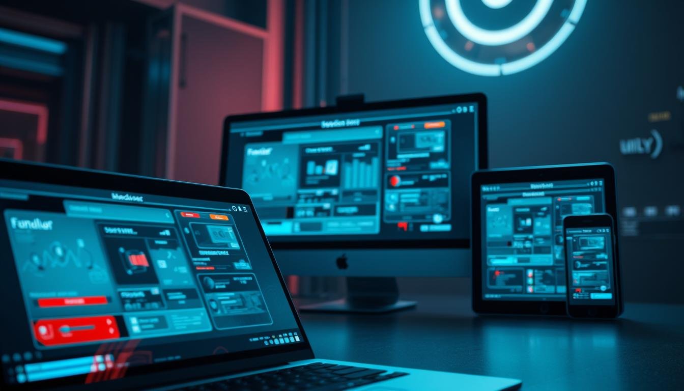
Creating interfaces that work well on all devices can be challenging. Your design might look perfect on one screen but break on another. This happens when elements don’t adapt properly to different screen sizes.
Unity provides powerful tools to solve this problem. The engine’s Canvas system and anchor points help maintain proper layout. These features ensure your interface elements stay where they should be.
This guide covers essential techniques for professional results. You’ll learn how to configure components for optimal display. The methods work across mobile, tablet, and desktop platforms. Mastering these skills ensures your project looks polished everywhere.
Key Takeaways
- Understand why interface elements need to adapt to various displays
- Learn Unity’s fundamental systems for layout management
- Discover anchor point configurations for stable positioning
- Master techniques that work across multiple device types
- Preview your design on different screen sizes during development
- Avoid common mistakes that cause layout problems
- Apply industry best practices for consistent user experience
Understanding the Basics of Responsive UI in Unity
Today’s digital landscape requires designs that maintain functionality across countless device configurations. Your application must look polished on various displays. This foundational knowledge prevents layout issues before they occur.
Importance of Adaptable UI for Different Devices
Users access applications on smartphones, tablets, and desktop monitors. Each device has unique display characteristics. Without proper adaptation, interface components may appear distorted or misplaced.
Poor layout affects user experience significantly. Elements might become unusable on certain screens. Consistent presentation builds user trust and engagement.
Overview of Unity’s UI System
The Canvas serves as the central container for all interface elements. This component scales content to fit various resolutions automatically. It forms the foundation for creating flexible layouts.
Every visual element must reside within a Canvas object. Buttons, text, and images depend on this relationship. Understanding this hierarchy is essential for effective design.
Proper configuration ensures your project maintains its intended appearance. This knowledge saves development time and prevents costly revisions later.
Setting Up the Canvas and Canvas Scaler Component
Proper UI implementation begins with establishing the correct foundation through the Canvas. This essential container organizes all visual elements within your project. The setup process determines how your interface adapts to different displays.
Creating the Canvas in Unity
Navigate to GameObject > UI > Canvas in the editor menu. This action generates the primary container for your interface elements. The Canvas appears as a rectangular outline representing your screen space.
Every visual component must reside within this container for proper functionality. Buttons, text labels, and images depend on this hierarchical relationship. Correct Canvas creation ensures organized element management.
Configuring the Canvas Scaler for Multiple Resolutions
The Canvas Scaler component automatically attaches to every new Canvas. This critical component controls how elements respond to various screen sizes. Configuration determines whether elements maintain fixed dimensions or scale proportionally.
Three scaling modes offer different approaches to resolution handling. Constant Pixel Size maintains fixed pixel dimensions across all displays. Scale with Screen Size adjusts elements based on resolution differences.
Constant Physical Size considers device pixel density for real-world consistency. The reference resolution serves as your design baseline for proportional scaling. Selecting the appropriate mode ensures optimal appearance across devices.
Anchoring UI Elements for Dynamic Layouts
Anchor points serve as the invisible framework that maintains visual consistency when screens change. These reference markers determine how each component behaves during display adjustments. Proper configuration prevents layout drift across different devices.
What Are Anchors and Why They Matter
Every visual component connects to specific anchor positions on its parent container. These four triangular markers define positioning relationships. When the parent changes size, elements move according to their anchor settings.
Without correct anchor placement, interface components drift to unwanted locations. A button anchored to the center will shift position on various displays. This can push important elements off-screen or cluster them awkwardly.
The anchor system maintains fixed distances between element corners and their reference points. This ensures consistent margins regardless of display dimensions. Strategic anchoring preserves intended layout structure across all screens.
Utilizing Anchor Presets Effectively
Unity provides preset configurations for common anchor positions. These shortcuts eliminate manual adjustment of individual anchor points. The visual grid interface offers corner, edge, and center options.
Select appropriate presets based on where each element should remain positioned. Corner anchors keep buttons fixed relative to screen edges. Stretch configurations allow panels to expand with their container.
Mastering these presets saves significant development time. Proper initial configuration prevents extensive debugging later. Efficient preset usage ensures professional results across all device types.
Exploring the Rect Transform and Anchor Presets
Mastering the Rect Transform properties unlocks precise control over how elements adapt to different displays. This specialized component forms the foundation for reliable layout management across various screen sizes.
Understanding Rect Transform Properties
The Rect Transform component replaces the standard Transform for all interface elements. Unlike 3D coordinates, it uses anchored positions and pivot points designed for 2D layouts.
Four blue circles represent your element’s bounding rectangle corners. Each connects to individual anchor triangles for independent control during screen changes.
Positioning Elements Using Anchor Presets
Anchor presets provide a visual interface for quick configuration. Click the preset icon in the Rect Transform inspector to access corner, edge, and stretch options.
Hold Shift while selecting a preset to simultaneously set the pivot point. This determines the origin for position, scale, and rotation operations. Proper pivot understanding ensures elements grow or shrink correctly in responsive layouts.
Techniques for responsive ui scaling unity
Selecting the right scaling strategy determines how your interface appears across various displays. The Canvas Scaler component provides three distinct modes for handling different screen sizes. Each approach offers unique benefits depending on your project’s requirements.
Ensuring Consistent UI Scale Across Screens
Constant Pixel Size mode maintains fixed pixel dimensions regardless of screen resolution. A 100-pixel button remains exactly 100 pixels on every device. This predictability works well for applications targeting specific known resolutions.
Scale with Screen Size mode adjusts elements proportionally based on resolution ratios. Components maintain their relative screen position across all devices. This method ensures visual consistency for diverse display configurations.
Comparing Different Canvas Scaler Modes
Constant Physical Size considers device pixel density for real-world dimensions. It attempts to maintain consistent physical measurements across screens. This mode depends on accurate DPI reporting from devices.
Scale with Screen Size generally provides the most versatile solution. It adapts layouts proportionally while maintaining element relationships. This mode serves as an excellent starting point for most projects targeting multiple screen sizes.
The optimal choice depends on your specific design needs and target platforms.
Implementing Layout Groups and Content Size Fitters
Layout automation components provide powerful tools for managing dynamic content across different displays. These systems handle element positioning automatically, reducing manual configuration work. They ensure consistent spacing and alignment regardless of content changes.
Working with Horizontal, Vertical, and Grid Layouts
Horizontal Layout Groups arrange child elements in a single row. They automatically calculate spacing and positioning based on group settings. This component works perfectly for navigation menus and button rows.
Vertical Layout Groups function similarly but stack elements in columns. They’re ideal for lists, settings panels, and any vertical structure. Both systems maintain consistent spacing during screen size changes.
Grid Layout Groups offer more complex arrangement capabilities. They position elements in defined rows and columns with automatic wrapping. This component excels at inventory systems and data tables.
Automatically Adjusting UI with Content Size Fitters
Content Size Fitters dynamically adjust element dimensions based on content. They can resize text boxes to fit longer strings or panels for added children. This component works independently or with layout groups.
The Horizontal Fit and Vertical Fit properties control resizing behavior. Options include Unconstrained, Min Size, or Preferred Size settings. Combining these tools creates adaptable layouts that respond to content changes automatically.
Utilizing Advanced Scripting for Dynamic UI Changes
C# scripting unlocks the full potential of Unity’s interface system for complex responsive scenarios. When basic layout tools reach their limits, custom code provides the flexibility needed for professional results.
Scripting UI Layout Adjustments in C#
Programmatic control over Rect Transform properties allows dynamic element repositioning during runtime. You can modify anchor positions, sizes, and pivots based on specific conditions.
This approach enables sophisticated behaviors that respond to player progression or device changes. Script-driven modifications ensure optimal layout across diverse display configurations.
Handling Orientation and Aspect Ratio Variations
Detecting the current screen aspect ratio enables intelligent layout adaptations. Your interface can adjust automatically for different aspect ratios like 16:9 widescreen or 4:3 traditional displays.
Mobile game development requires special attention to orientation changes. Users frequently rotate devices between portrait and landscape modes during gameplay. Proper handling maintains usability across all viewing orientations.
Unity provides built-in events for detecting screen changes. Hook into these systems to trigger layout adjustments when the aspect ratio or orientation shifts.
Optimizing UI Performance and Draw Calls
Performance bottlenecks can undermine even the most carefully designed interface layouts. Smooth operation across different hardware requires strategic optimization approaches.
Proper management ensures your project maintains excellent frame rates. This prevents lag and stuttering that can frustrate users.
Best Practices in Batching and Atlasing
Draw calls represent a primary performance challenge in interface rendering. Each separate operation requires significant CPU-GPU communication overhead.
Batching combines multiple visual elements into single draw calls when they share materials. This technique dramatically reduces rendering workload without quality loss.
Atlasing consolidates separate textures into larger combined files. Many distinct interface components can then share the same underlying texture resources.
Avoiding Costly Layout Rebuilds
Layout rebuilds occur when systems recalculate element positions and sizes. These operations become computationally expensive when triggered frequently.
Design stable layouts that don’t require constant recalculations. Minimize dynamic content that forces frequent updates to element properties.
Strategic planning prevents performance degradation during runtime. This ensures smooth interactions across all target screens and devices.
Testing, Debugging, and Refining Responsive UI Layouts
Validating your layout across various displays is the final step toward professional results. The Game View provides essential tools for this critical phase. You can preview how elements adapt to different screen resolutions without building your project.
Using Unity’s Game View and Scene View Tools
Select various aspect ratios from the Game View dropdown menu. The Free Aspect option lets you test arbitrary window sizes. This helps identify potential layout breaking points.
Fixed aspect ratios like 16:9 maintain consistent proportions during testing. The 2 by 3 editor layout shows both Scene and Game views simultaneously. This setup provides immediate visual feedback during adjustments.
Enable 2D mode in the Scene View for clearer editing. The Rect tool (hotkey T) reveals anchor relationships and boundaries. These visual cues help debug positioning issues efficiently.
Create a checklist of target resolutions for systematic testing. Verify that buttons remain accessible and text stays readable. Physical device testing catches issues that editor previews might miss.
Conclusion
Building adaptable interfaces requires understanding how visual components behave across diverse displays. This guide has equipped you with comprehensive techniques for professional results.
You now possess the complete workflow for creating effective layouts in Unity. From Canvas fundamentals to advanced scripting, these methods ensure your project maintains quality across all devices.
The true power lies in how Unity’s systems work together. Proper configuration of anchors, Rect Transforms, and layout groups creates harmonious interfaces. Thorough testing across various screen sizes guarantees consistent user experiences.
Remember that responsive design evolves throughout development. Regular refinement ensures new elements integrate seamlessly. This proactive approach saves time while delivering polished results.
Your investment in mastering these skills pays dividends across all platforms. Users will enjoy consistent, engaging interfaces regardless of their device choice.
FAQ
What is the main purpose of the Canvas Scaler component?
How do anchors and the Rect Transform work together?
Which Canvas Scaler mode should I use for a mobile game?
What are the benefits of using Layout Groups?
How can I test my UI on different aspect ratios?

Game developer with over 10 years of professional experience specializing in the mobile sector. George’s journey began with a passion for indie development, leading him to contribute to several successful mobile titles, including the critically acclaimed puzzle-platformer ChronoShift and the top-down strategy game Pocket Empires.